



We transcend the conventional, focusing on strategic planning, branding, and online presence to seamlessly integrate with your company. Together, we’ll transform your business into the competitive powerhouse you envision. Let’s redefine success—take the first step with Quez Media’s Digital Solutions.
We’re here to help. We could talk to you about “ROI,” the “bottom line,” and “actionable” ideas, but forget the buzzwords. We know you need more customers, and we want to give them to you. So if you have a project, a goal, or just an idea, tell us about it! We can quote it, offer advice, and help you plan it out. At Quez, we’re invested in you.

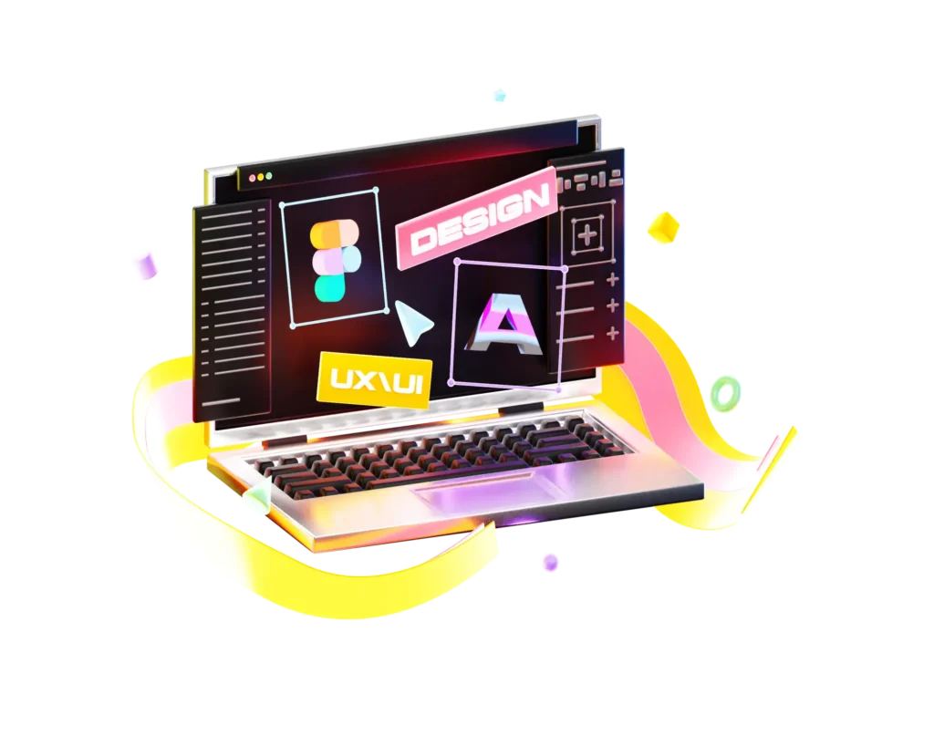
Forge a strong online presence through a standout website,
SEO optimization, and active social media engagement.
Boost brand visibility, outshine competitors by consistently delivering valuable content, and leverage online advertising for a winning edge.

Ignite your brand’s potential with our expert digital marketing services. Engage your audience, amplify your message, and drive growth. Partner with us to turn clicks into connections and grow your digital footprint.
Bring your online vision to life with our expert website development services. We specialize in creating bespoke, user-friendly websites that stand out and perform seamlessly. Let us build your unique digital presence.

Revolutionize your online presence with our comprehensive consultancy. With us, your website will not only be aesthetically pleasing but also strategic. Ready for online success?
Navigate the startup landscape with expert guidance on branding, audience building, and budget-friendly marketing.


Manufacturers: Propel traditional industries into the digital age with our innovative vision and strategies.

Overcome challenges in student acquisition and fundraising with targeted campaigns.


We are also actively engaged within a nonprofit activities.

Can’t find your industry? No problem. We’ve got solutions for you.
Quez Media Marketing has re-designed our logos, marketing materials and most recently re-designed new website for one of our new divisions. Our promotional products have been branded to connect with our clients and have come in under or at budget. They consistently come up with technique items that are a perfect fit for tradeshows and/or mailings. The quality of all products captures the attention of clients and enables us to spend out budget on other quality items, rather than needing to recreate the wheel.
We express our gratitude and delight in your service and products! From the paper quality to the full package product, it was just fabulous! We were so impressed when Quez Media Marketing even took time out of busy day to stop by and double-check with us that the final draft was correct and to our standards. We’re excited to work again with Quez Media Marketing team!
Quez Media Marketing always thinks outside the box and have brought several new ideas to COSE to help market out products and services. It is their innovative thinking and exceptional customer service that really differentiates them from other marketing firms.
Cleveland Clinic has partnered with Quez Media Marketing on various projects and has been impressed with professionalism, attention to detail, quality of product, flexibility and follow up. Most recently. Quez Media Marketing was asked to get involved with project that had a very high visibility and a tight deadline. The team at Quez Media Marketing went well beyond our expectations on this project.
I would highly recommend Quez Media Marketing as a partner for any marketing need.
Quez Media was instrumental in guiding us through a rebranding effort after a key acquisition.
Without their guidance and expertise we would not have been successful.
Quez Media has an extremely committed and talented team that will do whatever it takes to get the job done.
Don’t let your relatively small marketing budget stop you! Search Engine Optimization (SEO) is a powerful tool for driving organic traffic to your website, but many small businesses and startups
SEO isn’t quite dying, but AI answers present new complications. Historically, in the SEO landscape, businesses would be forced to compete against each other for the finite real estate of
Generative engine optimization could be the next generation of SEO. If you’ve read our blog or if you have any familiarity with digital marketing at all, you’ve probably heard of
Are PPC ads always worth the money? Pay per click (PPC) ads have been an incredibly popular marketing strategy for more than a decade now, offering a relatively simple yet
Repetition is the key to effective marketing; marketing is driven by repetition. “HeadOn: apply directly to the forehead! HeadOn: apply directly to the forehead! HeadOn: apply directly to the forehead!”
PBNs used to be valuable, but aren’t nearly as useful as they used to be. In the world of search engine optimization (SEO), the companies with the highest-ranked pages in
Don’t see a topic that interests you? No problem. Take a look at our articles prepared especially for you.
Web design, web development, social media, content, advertising, marketing, print, branding – this is what we do. It’s who we are.
Please take a moment to fill out the form below, tell us about your project, tell us about yourself, and we’ll get back to you right away!
By subscribing you agree to with our Privacy Policy and provide consent to receive updates from our company.
By subscribing you agree to with our Privacy Policy and provide consent to receive updates from our company.