Click here and start your project NOW – Click here and start your project NOW – Click here and start your project NOW – Click here and start your project NOW – Click here and start your project NOW – Click here and start your project NOW – Click here and start your project NOW – Click here and start your project NOW – Click here and start your project NOW – Click here and start your project NOW – Click here and start your project NOW – Click here and start your project NOW – Click here and start your project NOW –

Creative Services

Let Quez Media manage your creative services, and we'll craft a compelling online presence for you.

Let Quez Media manage your creative services, and we'll craft a compelling online presence for you.

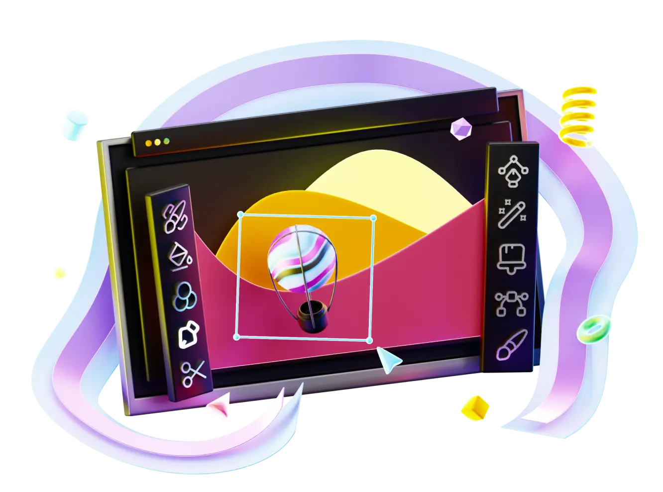
Craft a memorable image and a consistent voice.

Creative concepts are the key to injecting excitement into your audience. Our mission is to make your brand truly awesome, whether from scratch or by infusing new elements, leaving your audience awe-struck.

Captivate

Copywriting

Do you need a tagline or compelling copy for your marketing material?

The heart of copywriting is the art of persuasion, and without the right tone, wording, and style, your message could get lost in the clutter. Enlist Quez Media for copywriting services, and you’ll never have to worry about your message getting through.

Inspire

Web Design

Explore a new website design with Quez Media. Your website is the first impression for potential customers—make it count.

We integrate elements from your branding, marketing, and sales strategies to make your site a robust gateway for transforming visitors into leads and leads into customers.

Evolve

Branding and Identity

Shape and elevate your brand with Quez Media, crafting impactful first impressions and fostering unwavering customer loyalty.

Our specialized branding packages are designed to capture your company’s essence, ensuring a captivating presentation that resonates with your audience. Ready to embark on a journey of brand discovery?

Ready to see the results?

Let the results speak for themselves. Contact us today for a personalized consultation that will take your business to a new level.

Energy Choice Ohio is a brand new natural gas and electric utilities comparison tool and campaign of the Public Utilities Commission of Ohio (PUCO). The PUCO partnered with Quez Media to plan, brand, develop, write, and launch a campaign in a way that no other state department had ever attempted before. The result is a very cool and vivid brand using the state of Ohio’s brand colors. Marketing and advertising taglines are built cleverly around the Ohio.gov “O”, and the new Apples to Apples comparison tool is big, bold, juicy, and simple to use. The new website is incredibly informative and helpful to users who wish to compare service providers to find the best offers in their area.
Is that a box? Well… no. Not really. For KLN’s new print campaign, we really wanted to get the message across, so instead of just sending the recipient a typical tri-fold brochure, we thought: “Hey. Everybody loves getting a package.” So, we created a brochure that really looks like a box, complete with packing peanuts inside that frame the main service information. In addition to the print campaign, we have totally refreshed the KLN Logistics website. Big, attention-grabbing visuals rotate in the entire background of the home page, advertising the ground, air, and sea services of the company.
JurInnov is among the top firms in its industry, but the founders recognized that when it came to their existing branding and marketing, there was certainly a lot of catching up to do. Quez Media first worked with JurInnov to redesign their logo, which was simply an outdated type treatment cast in pastel colors that would have been best suited for a cupcake company. Quez modernized the type treatment, opting for a sleek, thin typeface colored in a more industry appropriate blue + gray combination. An abstract lock icon was added to the name to visually represent the company, which is reinforced by the introduction of an all-new tagline that perfectly sums up the wide range of otherwise overwhelming services. The lock can be taken either as open, or locked, representing eDiscovery, or eRecovery, respectively. The marketing materials were rewritten, simplified, and given a more creative touch than a simple tri-fold. The brochure stands alone as a laptop computer with the detailed services listed in the circuitry inside the keyboard. The complementing flyer is a simple one-pager, but designed to resemble a tablet.
John Carroll University called upon Quez to help with their enrollment marketing, looking for a fresh style and design of new marketing pieces that young collegiate types at the Jesuit school would take an interest in actually reading. After much collaboration, the resulting efforts produced a series of print pieces, including mailers and postcards advertising different events at the campus that used a photo-heavy design covered in white handwriting scripts, inspired by notes taken in class. A large format poster folded out to hang on the wall, featuring different chunks of information about John Carroll University in the different folded panels.

Hear from our satisfied customers

Energy Choice Ohio is a brand new natural gas and electric utilities comparison tool and campaign of the Public Utilities Commission of Ohio (PUCO). The PUCO partnered with Quez Media to plan, brand, develop, write, and launch a campaign in a way that no other state department had ever attempted before. The result is a very cool and vivid brand using the state of Ohio’s brand colors. Marketing and advertising taglines are built cleverly around the Ohio.gov “O”, and the new Apples to Apples comparison tool is big, bold, juicy, and simple to use. The new website is incredibly informative and helpful to users who wish to compare service providers to find the best offers in their area.
Is that a box? Well… no. Not really. For KLN’s new print campaign, we really wanted to get the message across, so instead of just sending the recipient a typical tri-fold brochure, we thought: “Hey. Everybody loves getting a package.” So, we created a brochure that really looks like a box, complete with packing peanuts inside that frame the main service information. In addition to the print campaign, we have totally refreshed the KLN Logistics website. Big, attention-grabbing visuals rotate in the entire background of the home page, advertising the ground, air, and sea services of the company.
JurInnov is among the top firms in its industry, but the founders recognized that when it came to their existing branding and marketing, there was certainly a lot of catching up to do. Quez Media first worked with JurInnov to redesign their logo, which was simply an outdated type treatment cast in pastel colors that would have been best suited for a cupcake company. Quez modernized the type treatment, opting for a sleek, thin typeface colored in a more industry appropriate blue + gray combination. An abstract lock icon was added to the name to visually represent the company, which is reinforced by the introduction of an all-new tagline that perfectly sums up the wide range of otherwise overwhelming services. The lock can be taken either as open, or locked, representing eDiscovery, or eRecovery, respectively. The marketing materials were rewritten, simplified, and given a more creative touch than a simple tri-fold. The brochure stands alone as a laptop computer with the detailed services listed in the circuitry inside the keyboard. The complementing flyer is a simple one-pager, but designed to resemble a tablet.
John Carroll University called upon Quez to help with their enrollment marketing, looking for a fresh style and design of new marketing pieces that young collegiate types at the Jesuit school would take an interest in actually reading. After much collaboration, the resulting efforts produced a series of print pieces, including mailers and postcards advertising different events at the campus that used a photo-heavy design covered in white handwriting scripts, inspired by notes taken in class. A large format poster folded out to hang on the wall, featuring different chunks of information about John Carroll University in the different folded panels.

CONTACT

Web design, web development, social media, content, advertising, marketing, print, branding – this is what we do.
It’s who we are.

(216) 910-0202

5005 Rockside Rd Suite 600-159, Independence, OH 44131, United States