Emails, instant messages, and texts have steadily grown to replace a lot of the face-to-face and vocal interactions that defined the professional and personal lives of generations past. At the risk of joining the old-fashioned critics that scorn such developments as 133t-sp3@k and emoticons, it’s painfully evident that textual modes of communication lack a certain… personality behind their words.
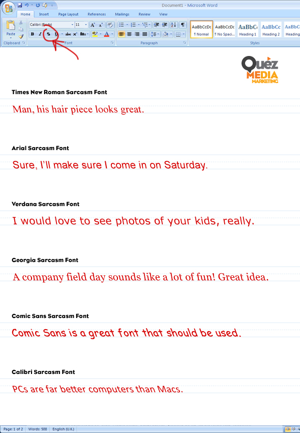
That’s why we’re introducing it here… the sarcasm font. Yes, yes, the French developed an Irony Mark ages ago to denote sentences with a second meaning—but its centuries-long failure to generate popular approval leaves it in punctuation purgatory (along with our hilariously named, impractical friend the Interrobang). Besides—let’s be honest here—including a French decoration is nowhere near as satisfying as brandishing an all-American slanted font when you’re highlighting your own clever disingenuousness.
If you’re anything like us, you spend a lot of time thinking of just the right wording to convey your sardonic sentiments—even more when the vague nature of digital text is at play. But with the sarcasm font, you can ensure that your carefully crafted satire is never mistaken for sincerity. Imagine the delight of knowing none of your brilliant quips will go unnoticed—even if they do go unappreciated—without having to resort to the burdensome juvenility and obnoxiousness of a winking emoticon (which, our sources tell us, is now Russian property).
The similarities to italicization will seem familiar to your verbal prey—but the backward slant will emphasize the cutting tone you want to seethe toward them, and probably give them the same irritating feeling that petting your dog the wrong way would seem to warrant. Your smartassery will finally carry across the binary mistranslations of the internet and phone networks of our technodependent generation—except maybe to your dyslexic cousin Fred… but you probably shouldn’t pick on Fred anyway.
So spread the word! Go forth, and start showing your witty smarm the classy, mature, all-American way.
Then again, maybe sass isn’t the route you want to go. Maybe you want to display your character more professionally—more in tune with your own business’s visual rhetoric. Well, we won’t be using our sarcasm font in saying that we’re here to make that happen. It’s easy to get crowded out or misrepresent yourself in the dense stagnation that 95% of the internet sinks into—but it doesn’t have to be that way. Get in touch with the pros—that’s right. Us. We’ll work with you and find creative solutions to keep your brand fresh, noticeable, and maybe just a little bit cheeky ;-)*
*that winky face cost us 100,000 rubles.


